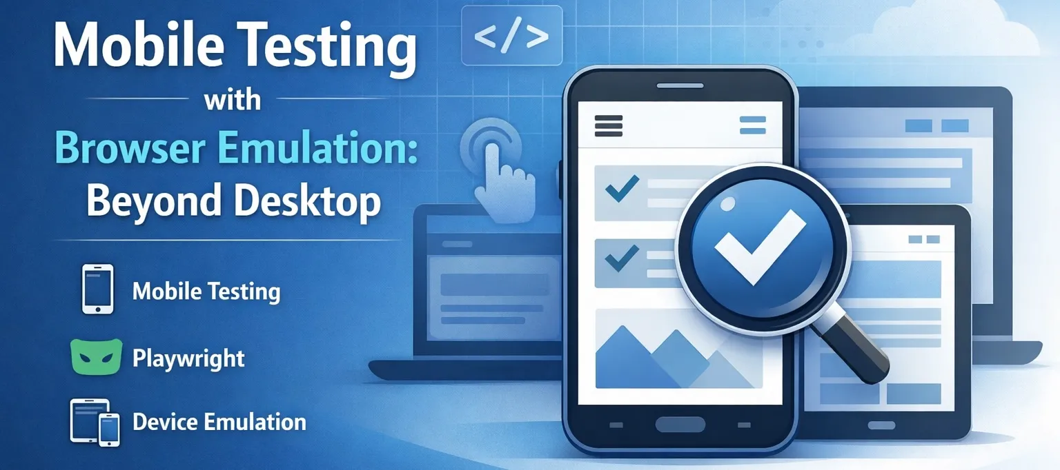
Desktop testing covers half the story. The other half is phones - and increasingly tablets. We just shipped mobile device emulation in Test-Lab. Here's what that means and how it works under the hood.
What we're launching
You can now select a target device when creating test plans. Instead of running tests in the default 1920x945 desktop viewport (sized to match a typical maximized Chrome on a 1920x1080 monitor), you can run them as an iPhone 15, Pixel 7, iPad Pro, or dozens of other device profiles.
The AI agent sees what a mobile user sees: the responsive layout, touch-friendly UI, mobile navigation patterns. If your hamburger menu breaks on small screens, the test catches it.
How Playwright device emulation works
Playwright ships with a device registry - a JSON mapping of real device specs to browser configuration. When you select "iPhone 15 Pro", Playwright sets up a browser context with specific parameters that mimic that device.
Here's what a device descriptor looks like internally:
{
  "iPhone 15 Pro": {
    "userAgent": "Mozilla/5.0 (iPhone; CPU iPhone OS 17_0 like Mac OS X) AppleWebKit/605.1.15 (KHTML, like Gecko) Version/17.0 Mobile/15E148 Safari/604.1",
    "viewport": { "width": 393, "height": 852 },
    "deviceScaleFactor": 3,
    "isMobile": true,
    "hasTouch": true,
    "defaultBrowserType": "webkit"
  }
}
Each property does something specific:
viewport - Sets the CSS viewport dimensions. Your media queries (@media (max-width: 768px)) respond to this.
userAgent - The string sent in HTTP headers and exposed via navigator.userAgent. Some sites serve different markup based on this.
deviceScaleFactor - Pixel density. iPhone 15 Pro has 3x density, meaning a 393px-wide viewport renders as 1179 physical pixels. Important for image loading and retina detection.
isMobile - Controls navigator.maxTouchPoints and other mobile-specific browser APIs. Some JavaScript checks this to enable mobile code paths.
hasTouch - Enables touch event simulation. Clicks become touch events. Hover states behave differently.
defaultBrowserType - iOS devices use WebKit (Safari's engine), Android uses Chromium. This affects rendering and JavaScript behavior.
What gets emulated vs what doesn't
Device emulation is powerful but it's not the same as running on actual hardware. Here's the honest breakdown:
Accurately emulated
- Viewport size - Pixel-perfect match to the real device
- User agent string - Exactly what the device would send
- Touch events -
touchstart,touchmove,touchendinstead of mouse events - Device pixel ratio -
window.devicePixelRatioreturns the correct value - Media queries -
(max-width: X),(orientation: portrait),(hover: none)all work - CSS viewport units -
vh,vw,dvhrespond correctly
Partially emulated
- Performance - The browser runs at your machine's speed, not the device's slower CPU/GPU
- Memory constraints - You won't hit the low-memory conditions mobile Safari is famous for
- Network - Runs at your connection speed unless you configure throttling
Not emulated
- Native features - Push notifications, camera access, biometrics
- App switching/backgrounding - The "mobile experience" of interrupted sessions
- Actual Safari/Chrome quirks - Emulation uses desktop browser engines pretending to be mobile
- Hardware acceleration differences - Some CSS animations that break on real iOS work fine in emulation
For QA testing of web apps, the emulated parts cover 90% of what matters. You're catching layout breaks, touch interaction bugs, and responsive design issues. You're not catching the edge case where iOS Safari on an A15 chip with 3GB RAM crashes.
Using device emulation in Playwright directly
If you're writing Playwright tests yourself, here's how device emulation works:
import { devices } from 'playwright';

const browser = await chromium.launch();
const context = await browser.newContext({
  ...devices['iPhone 15 Pro']
});

const page = await context.newPage();
await page.goto('https://your-app.com');
// Page renders at 393x852 with touch events
Playwright includes 100+ device presets. Popular ones:
iPhone 15 Pro,iPhone 14,iPhone SEPixel 7,Pixel 5,Galaxy S9+iPad Pro 11,iPad MiniDesktop Chrome,Desktop Safari,Desktop Firefox
You can also create custom configurations:
const context = await browser.newContext({
  viewport: { width: 375, height: 667 },
  userAgent: 'Custom User Agent String',
  deviceScaleFactor: 2,
  isMobile: true,
  hasTouch: true
});
This is useful when you need to test a specific viewport that doesn't match any preset - like a custom kiosk display or an unusual Android device.
The WebKit vs Chromium question
Here's something that catches people off guard: when you test "iPhone 15 Pro" in Playwright, you're not running Safari. You're running Playwright's WebKit build with iPhone settings applied.
Playwright maintains its own WebKit build that's patched for automation. It's close to Safari but not identical. CSS rendering differences, JavaScript timing quirks, and browser-specific bugs may not reproduce.
For most responsive design testing, this doesn't matter. The viewport, touch events, and user agent are what drive 95% of mobile-specific behavior. But if you're debugging a bug that only happens in "real Safari on real iOS", emulation won't catch it.
Same goes for Android. Playwright uses Chromium for Android device emulation. It's not the exact Chrome build that ships on Pixels or Galaxies.
When this matters:
- You're debugging a browser-specific rendering bug
- You need to test PWA installation flows
- iOS Safari's aggressive memory management is relevant
When it doesn't matter:
- Testing responsive layouts
- Verifying touch interactions work
- Checking that mobile navigation flows function
- Finding viewport-related CSS bugs
Gotchas and edge cases
Hover states
Mobile devices don't have hover. But emulation still lets you "hover" with mouse events. Some developers test on emulated mobile and miss hover-dependent UI that fails on real devices.
Good practice: design mobile UI that doesn't rely on hover. Test your :hover styles in desktop tests, not mobile emulation.
Safe area insets
Modern phones have notches and rounded corners. CSS env(safe-area-inset-top) handles this. Playwright emulation doesn't simulate safe areas - those CSS values will be 0.
If you're using safe area insets for layout, they won't behave the same in emulation. Test on real devices for pixel-perfect notch behavior.
Keyboard behavior
Virtual keyboards change the viewport on mobile. Type in an input and the keyboard pushes content up. Playwright doesn't simulate this - the viewport stays fixed.
For tests that depend on keyboard visibility (like chat apps or fixed-bottom buttons), this is a blind spot.
Scroll behavior
iOS Safari has rubber-band scrolling, address bar hide/show on scroll, and other scroll quirks. These are native behaviors not present in emulation. If your app does anything clever with scroll position or viewport height, test on real devices.
Fixed position elements
position: fixed behaves differently on iOS Safari when the keyboard is open or the address bar is visible. Emulation uses simple fixed positioning without these complications.
How Test-Lab uses device emulation
When you select a device in your test plan, we configure the browser context with that device's profile before the AI agent starts. The agent sees and interacts with your app exactly as that device would render it.
What this means in practice:
- AI screenshots show the mobile layout
- Touch targets get tested (that tiny button that's impossible to tap)
- Mobile-specific navigation is exercised
- Responsive breakpoints get hit
The AI agent doesn't know it's testing mobile vs desktop. It adapts to what it sees. If your mobile nav uses a hamburger menu, the agent opens it. If your mobile layout stacks elements vertically, the agent scrolls.
You can run the same test plan across multiple devices to catch device-specific bugs. Set up "Login flow" once, run it on iPhone 15, Pixel 7, and iPad to see how it behaves at each viewport.
Testing strategy: which devices to pick
You don't need to test every device. Pick a representative sample:
Small phone (iPhone SE, ~375px width) - Catches layouts that break at narrow viewports. If it works here, it works on most phones.
Standard phone (iPhone 15 Pro, Pixel 7, ~390px width) - The most common form factor. Your primary mobile test target.
Large phone (iPhone 15 Pro Max, ~430px width) - Some apps have a tablet-like layout at larger phone sizes. Worth testing if you do.
Tablet (iPad Pro 11, ~834px width) - The awkward middle ground. Many apps fall apart here because they're neither phone nor desktop.
Desktop (1920px width by default) - Still your largest user segment for most B2B apps.
Start with standard phone + desktop. Add others as you find device-specific bugs in production.
When emulation isn't enough: real device testing
Some apps have platform-specific implementations that go beyond what emulation can catch. Native feature detection, platform-specific SDKs, hardware-dependent behavior, or apps that serve entirely different codepaths based on actual device fingerprinting.
If your app does things like:
- Detect real iOS vs Android to load platform-specific modules
- Use hardware APIs (camera, accelerometer, biometrics)
- Integrate with native SDKs that behave differently in emulation
- Serve different builds based on device capabilities
Emulation won't cut it. You need the real thing.
Our Custom plan includes real device testing - actual iPhones, Pixels, and tablets running your tests. Same AI-powered automation, but on physical hardware instead of emulated browsers. Contact us if your app needs this level of fidelity.
What's next
Mobile emulation is the first step. We're exploring:
- Network throttling - Test on simulated 3G/4G connections
- Geolocation mocking - Test location-aware features
- Orientation changes - Test portrait/landscape transitions
- Dark mode - Test
prefers-color-schemevariations
For now, pick your devices and start catching mobile bugs before your users do.
Ship responsive apps with confidence. Try Test-Lab - test your mobile and desktop flows with AI-powered browser automation.