
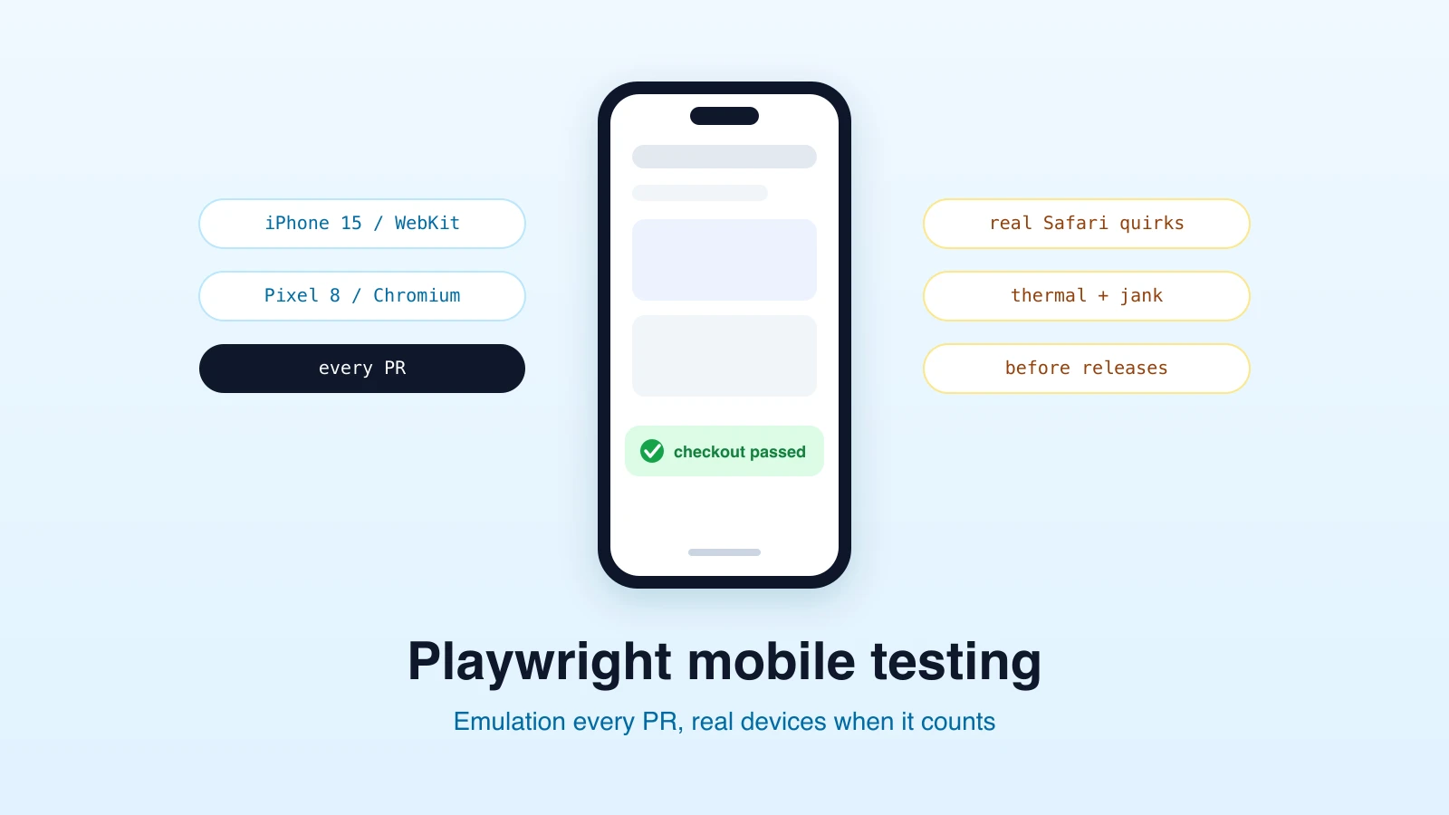
Playwright mobile testing means one decision before any code gets written: emulate a device in a desktop browser, or run on real hardware. Playwright is excellent at the first and deliberately does not do the second, so the honest question is whether emulation covers what you need to verify. For most web teams the answer is yes for 90% of mobile checks, and knowing which 10% it cannot cover is what this post is for.
What Playwright emulation actually does
Playwright ships a registry of device descriptors that configure a browser context to behave like a phone or tablet:
import { test, devices } from "@playwright/test";

test.use({ ...devices["iPhone 15"] });

test("mobile nav opens", async ({ page }) => {
  await page.goto("https://app.example.com");
  await page.tap("[aria-label='Menu']");
  await expect(page.getByRole("navigation")).toBeVisible();
});
One test.use line sets the whole bundle: viewport size, device pixel ratio, a mobile user agent, touch event support (hasTouch), and the isMobile flag that switches browser behaviors like the visual viewport and meta-viewport handling. You can also compose it manually for a custom device:
test.use({
  viewport: { width: 393, height: 852 },
  deviceScaleFactor: 3,
  isMobile: true,
  hasTouch: true,
  userAgent: "Mozilla/5.0 (iPhone; CPU iPhone OS 17_0 like Mac OS X) ...",
});
Add geolocation, locale, timezone, and permissions on top and you have a solid stand-in for a phone in the field:
test.use({
  ...devices["Pixel 8"],
  geolocation: { latitude: 52.52, longitude: 13.4 },
  permissions: ["geolocation"],
  locale: "de-DE",
});
One correction to a common mental model: emulating an iPhone in Chromium does not give you Safari. Engine quirks are engine quirks, so run iPhone descriptors against Playwright's WebKit build to get meaningfully closer to iOS rendering behavior. We went deep on that distinction, and on which properties are accurately emulated versus approximated, in our browser emulation guide.
What emulation verifies well
- Responsive layout: breakpoints, overflow, content that collapses or hides at phone widths. This is the bulk of mobile bugs, and emulation catches them reliably.
- Touch-dependent behavior: tap targets, mobile menus, swipeable carousels driven by pointer events.
- Mobile-specific code paths: anything keyed off user agent,
isMobilelayouts, or the visual viewport. - Form usability: input types, autocomplete attributes, and validation flows at mobile sizes.
- Locale and geolocation flows: region-dependent behavior without leaving your desk.
Because emulated contexts are just browser contexts, they parallelize like any other Playwright test: a phone, a tablet, and a desktop run of the same suite are three projects in the config, not three lab benches.
What only real devices verify
- Real rendering performance: a mid-range Android phone's jank, thermal throttling, and memory pressure do not emulate. A desktop CPU pretending to be a phone is still a desktop CPU.
- True Safari on iOS: WebKit-the-Playwright-build is close; Safari-the-iOS-app, with its toolbar behaviors, safe-area insets in the wild, and iOS-specific bugs, is only itself.
- OS-level integration: native keyboards and autofill, permission dialogs, push notifications, app-switching, and the share sheet.
- Native gestures: multi-touch, pinch-to-zoom fidelity, and momentum scrolling physics are approximations at best in emulation.
- Network reality: real radios on real networks behave worse than any throttling profile.
If a bug report says "on my phone," and your emulated repro passes, believe the phone: the classes above are exactly where the two diverge.
A decision rule that holds up
Run mobile emulation continuously and real devices occasionally. Concretely:
- Every PR / every deploy: emulated mobile runs of your critical journeys (one iPhone-class WebKit project, one Android-class Chromium project covers most risk).
- Before releases and after big UI changes: a manual or service-based pass on a small set of real devices, focused on the categories emulation cannot see.
- When a real-device-only bug class bites you twice: promote that specific check to whatever real-device setup you use.
Teams get this backwards by making real devices the default and then running mobile checks rarely because they are slow and expensive. Frequency catches more bugs than fidelity for layout and logic; fidelity catches what frequency cannot for performance and OS integration. Use both where they are strong.
Mobile testing without maintaining the harness
Everything above assumes you are writing and maintaining the Playwright setup yourself. The same coverage is available at the plain-English level: describe the journey, pick a device profile, and let an AI agent run it in an emulated mobile browser with screenshots and step evidence at phone dimensions. That is how mobile testing works on Test-Lab: the device matrix is a dropdown, WebKit-for-iPhone included, and the same test plan runs across desktop and mobile profiles without a config file. For teams that want mobile coverage on every deploy without owning the projects matrix, it is the shortest path.
Frequently asked questions
Can Playwright test on real mobile devices?
Not natively. Playwright drives desktop browser engines with device emulation. For real hardware you pair it with a device cloud's emulation-adjacent offerings, or use separate native-focused tooling for the small set of checks that truly need hardware.
Is Playwright mobile emulation accurate enough for testing?
For layout, touch interactions, mobile code paths, and forms: yes, and it is the right default because it runs on every commit. For rendering performance, iOS Safari specifics, and OS integration: no, keep a small real-device pass for those.
How do I emulate an iPhone in Playwright?
test.use({ ...devices["iPhone 15"] }), and run it in the WebKit project rather than Chromium so the engine matches iOS more closely. The descriptor sets viewport, scale factor, user agent, touch, and the isMobile flag together.
Want mobile runs of your critical flows on every deploy, described in plain English? Try Test-Lab free and pick a device profile from the dropdown.
Related reading:
- Mobile testing with browser emulation - what emulation covers, engine by engine, and our device matrix
- Test geo-restricted sites - pairing device profiles with location
- How to fix flaky tests - because mobile viewports surface timing bugs first